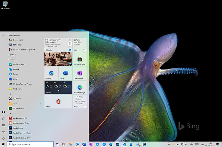
It has been 5 years and 10 updates since the release of Windows 10. 20H2 is their latest build. Although it is a minor update compared to 2004, it comes with many revamps in various departments.

20H2 is built on top of a previously released version that is now completely functional. In theory, if you’re running version 2004, you already have the majority of the bits for 20H2 loaded as part of the monthly cumulative releases. This article is all about the new features in Windows 10 20H2.
Reanimating icons and the Start menu

Windows 10’s Start menu has constantly been evolving since its initial release. The 20H2 update is probably the most significant yet. It’s intended to showcase Microsoft’s new Fluent Design icons while also enhancing support for Windows 10’s Dark and Light modes.
Most of Microsoft’s own apps now have icons that support the new modes. The resulting mix of semi-transparent tiles and new icon formats works remarkably well. For a more consistent look and feel, the new Fluent icons are now included in the taskbar and Start menu applications list.
Microsoft has revamped Notifications, eliminating the obnoxious warning that appears when you switch to focus mode. The functionality of the notification bar and notification pop-ups has been changed, with icons to help you recognize which application created the notification. Tablet mode has been removed from desktops and laptops that lack touch support.
All new Chromium-based Edge browser
The newest Edge is built on the same open-source Chromium code base as Google’s Chrome. Hence it should have fewer compatibility problems for web apps than before. The updated Edge integrates even more deeply into Windows 10. It now has support for browsing and managing browser tabs in the Windows 10 Alt+Tab task switcher.
You can see all active tabs by default. You can also adjust the number of recent tabs displayed in the Settings > Multitasking section if you wish. Microsoft has added many of its own functionalities to Edge. One such feature is Collections, which allows you to store and exchange sets of tabs with colleagues.
The transition of the Settings menu
The Settings menu in Windows 10 is anticipated to replace the old Windows Control Panel gradually. It has been a relatively slow process, with each patch bringing one or two new settings.
The majority of the updates this time are in the app’s core System portion. That means the old System part of the Control Panel is no longer accessible, as all of its functions are now available in Settings.
Ready to test
Microsoft recently made the latest beta builds of 20H2 eligible for commercial pre-release approval. It’s a strong indication that Microsoft has finalized the features in its release build. It can either be downloaded from Windows Update, hosted in WSUS, or installed from an ISO.
Based on the general availability of the 2004 build for several months, this is a reliable and successful build. It should perform well as an improvement to 1909 or any 2004 builds you might be having. The latest additions make sense. The user interface’s redesign with new icons and Start menu tiles provides a much-needed refresh to Windows 10.
Recommended for you:
